ShopDreamUp AI ArtDreamUp

Deviation Actions


Comments57
Join the community to add your comment. Already a deviant? Log In
Been a long time since I've written one of these, I forgot they made it so you could write them without a premium (just can't request them). I'm by no means an expert or an art teacher, but I'll share what knowledge I have. <img src="e.deviantart.net/emoticons/a/a…" width="19" height="19" alt="
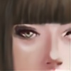
Anyway, as the ratings say the vision for this is excellent. There's a lot going on here to make your viewers think. Like the light bulb and the gears, they add a steam punk feel and the girl's attire looks fitting to that as well.
The technique is the only thing that needs a little work I think, and after that the impact would be higher. The few problems I see are that the girl's neck is a bit too long, one of her shoulders looks a bit longer than the other, (just nit picking anatomy, which comes with practice and/or anatomy classes) and her body looks a bit flat overall. I know there is the strong yellow light coming from behind which makes you think that there wouldn't be enough light to create the correct definitions on her torso, however that doesn't read the the viewer quite as well.
For something like that I'd generally suggest either making parts of the body fade into the darkness a bit more (like where it starts to in the left bottom corner) or adding some reflected light from an unknown source off the page. Reflected light can really go a long way sometimes, and it's something a lot of artists overlook. I notice there's a hint of some possible blue light on the brick wall behind her and on her hair on the left side. I think more of that could have been used to help the torso take shape a little more.
Other than just those anatomical problems, I think some parts could use a little more sharpness. The face is the sharpest (as it should be if it's the main focus) but a few other places look a little bit awkwardly blurry. The gear directly behind her head, for instance, looks a little bit too soft compared to the sharper textures of the wall behind it. When directing the viewer's eye through blurring/sharpening certain parts of the piece, it's best to stay consistent, as if you were taking the picture with a camera. That means that, in this case, the wall would maybe be slightly more soft/blurry than the gear, or the gear would be a little sharper/crisp than the wall it's mounted on. Personally, the wall doesn't look like it's meant to be very far behind her so I would have aired more on the side of sharpness here rather than going for a "depth of field" look, especially with the light bulb being a focal point as well.
One way to sharpen things here would be to just increase the contrast in a few places. Like if you took a a really light yellow, thin brush and carefully touched up the corners on the gear where the light is strongest, that might help. I also think the center/filament area of the bulb could be a little brighter. However, there is a chance that doing these things would take the focus off the face a little to much as well, so it might not be as simple as all that. <img src="e.deviantart.net/emoticons/a/a…" width="19" height="19" alt="